Sirkel: Connecting Brand Identity, Digital Experience and Business Purpose
Sirkel brings together three offerings: Space, Service and Studio. Its integrated workspace supports startups, entrepreneurs and growing businesses with places to work, operational services and business development support.
Marketing Bee developed a brand and digital presence that makes this connected offering easier to recognise and understand. At the centre of our approach was the circle within Sirkel’s logo, a distinctive detail that became the foundation of its website experience.
Client: Sirkel
Location: Chattogram, Bangladesh
Services: Brand Identity, UI/UX Design, Website Design and Development, Social Media
Website: sirkelinc.com
01. The Challenge
Communicating More Than a Workspace
Sirkel needed to introduce an offering that extends beyond desks and offices. Its identity had to bring several services together, while its website needed to help prospective members understand which options suited their business.
We approached the project with three priorities:
- Establish a recognisable visual identity.
- Explain Space, Service and Studio under one clear brand.
- Help visitors move from discovering Sirkel to exploring its spaces and making an enquiry.
02. The Brand Strategy
One Visual Idea Across Every Touchpoint
We developed Sirkel’s identity around the yellow circle within its wordmark. This gave the brand a focal point that could work across static graphics, digital interfaces and motion.
Our design approach uses the circle to express connection between people, their working environment and the support available to them.
Blue gives the identity a structured foundation. Yellow brings energy and draws attention to key details. The Space, Service, Studio descriptor sits alongside the wordmark, connecting the logo directly with Sirkel’s offering.
These elements established a consistent visual language for the website and social media.
03. Bringing the Brand Into the Website
Turning Recognition Into an Experience
We made the circle central to the website’s opening sequence.
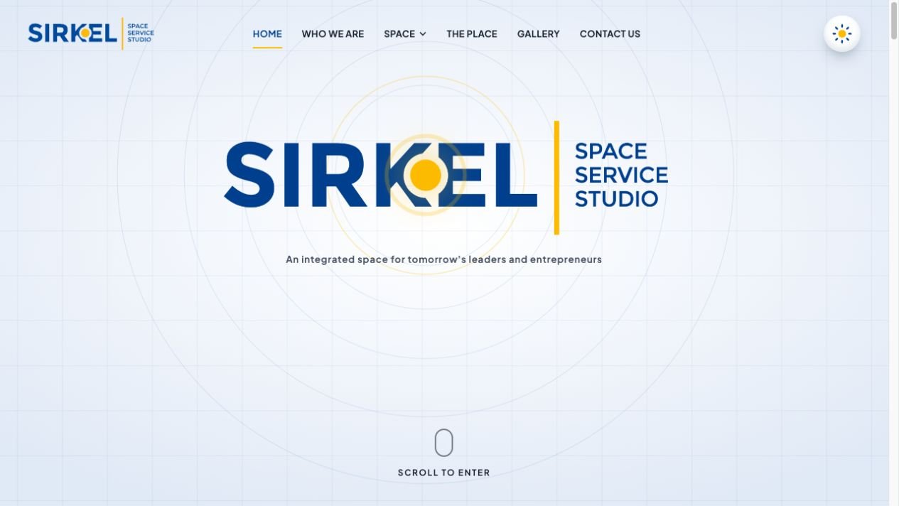
The hero begins with the Sirkel wordmark surrounded by concentric rings. The yellow circle pulses as rings expand and fade around it, drawing attention to the brand’s signature detail.
As visitors scroll, a circular window opens behind the logo and reveals the workspace photograph. The window expands across the hero, the logo becomes smaller, and the tour buttons and contact details appear.
This transition connects the identity with the physical environment. Visitors first encounter the brand, then discover the space through it.
The circle becomes both a recognisable brand asset and an entrance to Sirkel’s world.
Giving the Creative Experience a Clear Purpose
Beyond the hero, we organised the website around the information prospective members need.
Visitors can explore workspace options, review amenities, browse photographs and move towards a tour enquiry. Private offices, hot desks, dedicated desks and meeting spaces appear as distinct choices within the same experience.
The enquiry form asks about service interests and team size, helping visitors communicate what they are looking for.
The journey moves naturally from introduction to exploration, then towards a conversation.
Light and Dark With a Consistent Identity
We created complementary light and dark modes while keeping Sirkel recognisable in both.
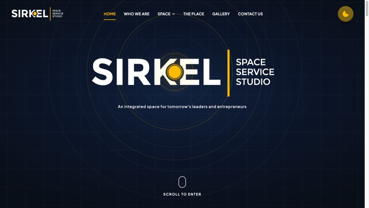
Light mode uses the blue wordmark against a bright background. Dark mode introduces white lettering against deep navy. The yellow circle and accents remain consistent across both appearances.
The theme switch updates the interface and logo treatment together. The website remembers the visitor’s selection and follows their device preference when no choice has been saved.
A glimpse of the website
04. Extending the Brand Through Social Media
Our social media work carried Sirkel’s identity beyond the website, supporting communication around its spaces, facilities and integrated offering.
The focus was a consistent introduction to the business, connecting what people discover on social media with what they encounter on the website.
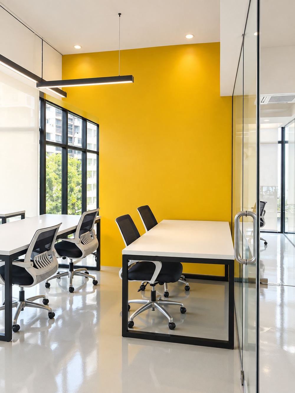
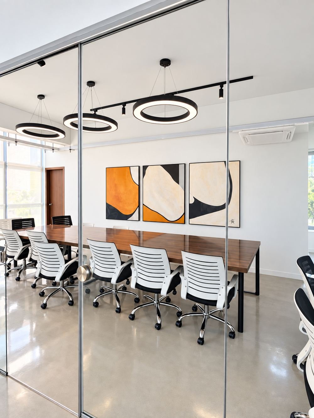
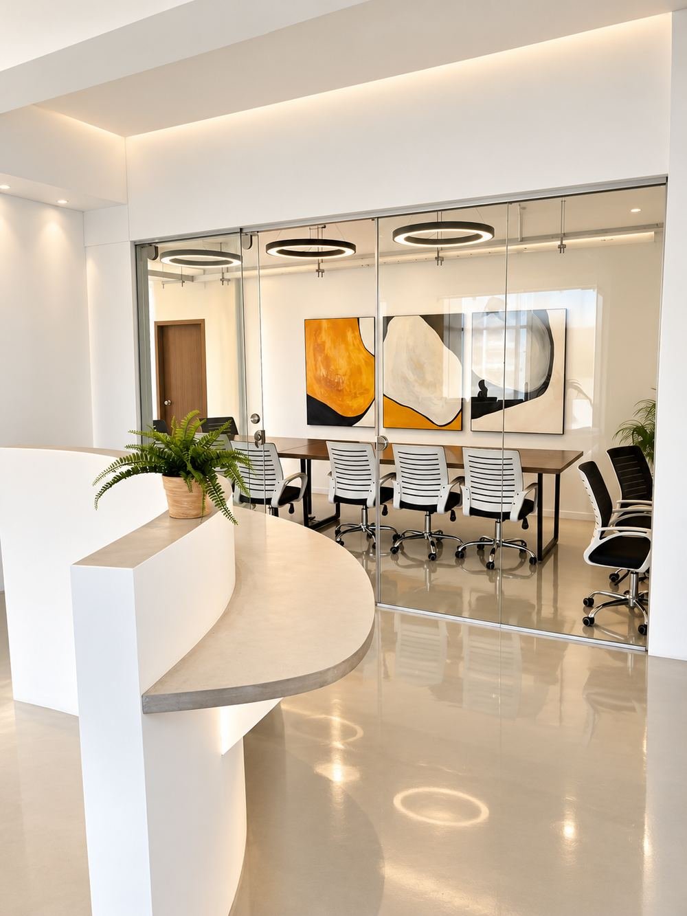
The spaces behind the brand
Workspace photography featured on Sirkel’s website brings the physical environment into the digital experience.
05. The Outcome
Sirkel has a connected brand and digital presence built around a distinctive visual idea.
The identity establishes recognition. The animation connects that identity with the workspace. The website explains the offering and provides a route to an enquiry.
From the circle in the logo to the opening scroll experience, each element contributes to the same purpose: helping people recognise Sirkel, understand its value and explore what it offers.